What’s Wrong With This Dialog?
Sometimes I can’t help myself. This week, I read a blog post asking what was wrong with a dialog. I found plenty of stuff wrong, so I decided to write a response and create a replacement dialog. This is not intended as an attack on the dialog author. I hope it’s not received that way. Rather, I just felt an itch to answer the question posted with my own opinion on the subject.
Read on for the gory details.
Deciding what’s wrong
When I find myself asking if a feature is “wrong”, the first thing I do is ask if the feature should even exist. That is especially important with dialogs. Dialogs interrupt a user’s work flow, and for whatever non-deterministic-human-psychological reason, in-line GUI elements tend to interrupt humans less than pop-up dialogs. I try to avoid dialogs, and pop-ups, almost religiously. So when I find myself asking, “what’s wrong with this dialog?”, the next question I ask is “should this dialog even exist?”. Unfortunately, in this article, I can’t tell whether that’s the case, so I’ll assume it must exist.
The litany
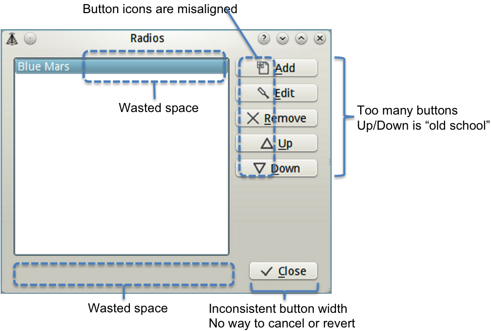
In my view, this dialog contains many mistakes. Its core functionality is certainly accessible, but it’s not as easy as it should be. Here’s my list of mistakes:
Now I’ll try to explain myself in prose rather than pixels.
Mistake 1: Too many buttons
This dialog provides a simple CRUD user interface, but it has 6 buttons. That’s too many buttons for such a simple task
Mistake 2: Wasted space
Don’t get me wrong. I’m a fan of liberal white space between elements. I think it puts users at ease, when used properly. But in this case, there is too much wasted space.
Mistake 3: Misalignment
The 6 buttons all have icons, but none of the buttons or text align vertically. This forces the human eye to read more carefully, causing unnecessary stress.
Mistake 4: No way to revert
If I make a mistake with this dialog, my only option is to manually revert my changes. Sometimes this approach is okay, especially with simple dialogs like this one, but as a user, I find it comforting when there is a “cancel” button to rescue me from my own fat fingers. I realize that the GNOME project usually follows the “apply-as-you-type” paradigm, but I prefer the OK/Cancel/Apply approach.
Mistake 5: Editing, Deleting, and Re-ordering is too hard
Although the “focus-and-click” method for editing, deleting, and re-ordering has seen a lot of use over the years, I find it dated and confusing to users. I much prefer to inline the “edit” and “remove” buttons as close to their respective elements as possible, reducing confusion about exactly what will be deleted when I click a button. Also, clicking “Up” and “Down” to move the focused item in the list is old school. Much better to drag and drop in modern user interfaces.
The Proposal
If I woke up in the UI designer’s shoes tomorrow, and this dialog was my number one priority, I would probably refactor it as follows:
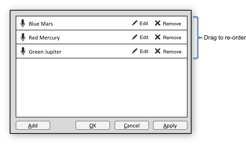
Improvement 1: Easy editing
The actions of the “Edit” and “Remove” buttons are super obvious. To edit an item, click the “Edit” button right on it. No ambiguity. You also don’t have to worry about graying out buttons when there is no selection.
Improvement 2: Drag and drop
To re-order items in the list, just drag ’em.
Improvement 3: Cancel
If you don’t like your changes, click “Cancel”. Also, if you want to see the effect of your changes without closing the dialog, click “Apply”. Very handy if you want to try out lots of little changes without having to re-open the dialog between each change.
Improvement 4: No focusing
Now that the “Edit” and “Remove” buttons are in-line with the list items, there’s no need for a selection/focus model at all. That’s one less thing the user has to worry about.
Improvement 5: Simpler layout
The layout is essentially vertical. The user sees two areas, one above the other, and the two areas do only one thing each. The top area contains the list of editable items. The bottom area deals with saving your changes (the “add” button is a small exception). I think this design is more approachable and easier for a user to understand quickly.
Conclusion
So that’s what I propose. A simpler, cleaner approach using modern methods to make the editing task easier on users. It doesn’t make them think about the user interface, but rather they are freed to think about the task they want to accomplish with the user interface.
6 comments to “What’s Wrong With This Dialog?”
Hi! I’m the guy that asked! ;-)
If you read the post, this is for a chapter in my book. The chapter is about “fixing” initial UI designs. The dialog you saw was very similar to what comes with the RadioTray app (not mine).
The stuff about the wasted space, the button size and the icon misalignment was already covered, and the inline buttons were already suggested.
OTOH, losing the “up/down” buttons is something I have mixed feelings about.
On one hand, I agree, they are clunky.
On the other hand, if you go D&D only the feature is basically impossible to discover for random users. Remember, we live in a world where people double-click web links.
On yet another hand, is manual sorting really a feature worth having? The result of this is just a popup menu. Wouldn’t it be better to just have (for example) the three last used, a separator and the rest in alphabetic order?
Also, having a “radio” icon on each row I have doubts about, since the icon will be exactly the same in each row. It’s just decoration providing no function.
Roberto,
About re-ordering items: How about putting up/down buttons on each item (to the left of “Edit”) to make it more obvious for users? If you clicked the up or down button, the items would animate to swap places. I’m glad that you are thinking about whether this feature is even necessary. That is much better to consider than *how* to implement it.
Along those same lines, if this is really just to edit the contents of a context menu, it would probably be better to make this part of the context menu rather than a separate dialog. Users could edit and re-order the items directly in the context menu, or it could morph into something editable when they click an item in the context menu. It would be best if the “morphed thing” resembled the context menu, so users could easily understand the effect of their edits. That would interrupt their work-flow much less, and probably make for a better user experience.
About the radio icons: Just pure decoration, indeed, but sometimes that kind of aesthetic nicety makes the UI feel more polished and comfortable to users, even if doesn’t provide extra functionality (although, I often consider “polish” and “comfort” to be functionality).
One more thing that occurred to me after reading some comments on your blog post: If a “radio” consists of simply a name and a URL, just put that text in-line in each element and remove the “Edit” button completely. When the user hovers the mouse over the name/URL a QLineEdit appears making the text editable.
Just some thoughts.
–Dave
Again, the problem with the editable popup is discovery. It looks like a popup, but when you do something, it acts in a completely different way than all other popup menus.
I read a few days ago something like “developers should stop trying to achieve added value by weirdness” :-)
The problem with putting the URL inline is that URLs are ugly. And usually you don’t really edit them, you just copy/paste them.
Roberto: Correction, it only acts differently when you edit it. Otherwise, it acts exactly the same as other context menus. Furthermore, most context menus don’t offer an edit feature, so this is territory where a de-facto standard behavior has not been established. I take that as an opportunity to make something truly intuitive, without hanging onto the decades of baggage that dictates an inferior, albeit familiar, design. In this day, when the Web is the most commonly used framework for delivering user interfaces to end-users, the context menu is very seldom used, so I would feel more free to explore new ideas. Just my recommendation. May be worth what you paid for it. :)
Another cool feature would be to show a preview of the context menu you are editing. As you make changes to the radio items, the preview would automatically update to reflect what it will look like when you are done. I like that one!
i am taking all these suggestions into my book. Welcome to the credits file :-D
http://code.google.com/p/python-no-muerde/source/browse/gracias.txt