Cool QProgressBar Stylesheet
Qt’s powerful stylesheet system can make your boring progress bars look really cool.
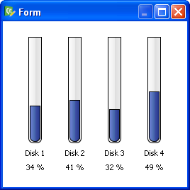
Screenshot:
Here’s the code:
QProgressBar {

border: 1px solid black;

text-align: top;

padding: 1px;

border-bottom-right-radius: 7px;

border-bottom-left-radius: 7px;

background: QLinearGradient( x1: 0, y1: 0, x2: 1, y2: 0,

stop: 0 #fff,

stop: 0.4999 #eee,

stop: 0.5 #ddd,

stop: 1 #eee );

width: 15px;

}
QProgressBar::chunk {
background: QLinearGradient( x1: 0, y1: 0, x2: 1, y2: 0,
stop: 0 #78d,
stop: 0.4999 #46a,
stop: 0.5 #45a,
stop: 1 #238 );
border-bottom-right-radius: 7px;
border-bottom-left-radius: 7px;
border: 1px solid black;
}
And here’s the .ui file you can open in Designer (right-click that link and choose “Save as…”).
Happy hacking!
11 comments to “Cool QProgressBar Stylesheet”
thanks dave,
that is looking very cool.
would you know if it is possible to make a gradient for the slider that starts at one color (for example blue for cool)
and as you increase the slider it will show a gradient that slowly goes to red.
if i try it just shows the blue to red gradient scaled to the little bit of the progress bar that is visible.
no worries if you don’t or can’t answer, just thought i’d ask.
cheers,
tom
my try for a horizontal slider:
QProgressBar {
border: 1px solid black;
text-align: top;
padding: 1px;
border-top-left-radius: 7px;
border-bottom-left-radius: 7px;
background: QLinearGradient( x1: 0, y1: 0, x2: 0, y2: 1,
stop: 0 #fff,
stop: 0.4999 #eee,
stop: 0.5 #ddd,
stop: 1 #eee );
width: 15px;
}
QProgressBar::chunk {
background: QLinearGradient( x1: 0, y1: 0, x2: 1, y2: 0,
stop: 0 #0000ff,
stop: 1 #ff0000 );
border-top-left-radius: 7px;
border-bottom-left-radius: 7px;
border: 1px solid black;
}
but as you can see it shows [blue–>Red| ] on a half full slider
where i would expect to see[ blue–>purple ]
and only see [blue———->red] when the value is 100%
Tom,
I believe that is not possible. You could do it, but you’d have to do it in your C++ code and update your stylesheet after each progress update using setStyleSheet().
Let me know what you find out!
–Dave
Hey Dave…I worked with you via correspondence at your previous gig and just wanted to wish you the best; I was just googling for any tricks to display greater than 100% in a QProgressBar (not looking very likely without subclassing) and noticed your blog came up near the top of the 2nd page of my results; congrats!
Just wondering if you know how to set the style of a progress bar when it’s disabled? I’ve tried QProgressBar::chunk:disabled but that doesn’t seem to work
BA, have you tried QProgressBar:disabled::chunk?
nevermind, found the issue. it was a small typo in my CSS.
QProgressBar::chunk:disabled is correct
Hi Dave,
i realised i never got back to you,
yes the code wise changing of the colour-slider worked. just needed to calculate the right blend
it’s in pyqt, but should be easy to read:
note slider is horizontal with a min value of 0 and max = 20.
int inValue = getValueFromHeater();
self.heatProgressBar.setValue(inValue)
# make the slider show blue to red from left to right
if( inValue >= 0 ):
percentage = inValue * 0xFF / 20
#calculate the blend
redTo = str(hex(percentage))
redTo = redTo.replace(‘0x’, ”)
if( len(redTo) <2 ):
redTo = "0" + redTo
blueTo = str(hex(0xFF-percentage))
blueTo = blueTo.replace('0x', '')
if( len(blueTo) <2 ):
blueTo = "0" + blueTo
if( inValue == 20):
astyle = "QProgressBar {background-image: url(:/IVD/images/transparent.png); border: 2px solid white; border-radius: 8px; } QProgressBar::chunk:horizontal { border-top-left-radius: 4px; border-bottom-left-radius: 4px; border-top-right-radius: 5px; border-bottom-right-radius: 5px; border: 1px ; background: qlineargradient(x1: 0, y1: 0.5, x2: 1, y2: 0.5, stop: 0 #0000FF, stop: 1 #%s00%s ); }" % (redTo, blueTo)
else:
astyle = "QProgressBar {background-image: url(:/IVD/images/transparent.png); border: 2px solid white; border-radius: 8px; } QProgressBar::chunk:horizontal { border-top-left-radius: 4px; border-bottom-left-radius: 4px; border: 1px ; background: qlineargradient(x1: 0, y1: 0.5, x2: 1, y2: 0.5, stop: 0 #0000FF, stop: 1 #%s00%s ); }" % (redTo, blueTo)
if( inValue == 1):
astyle = "QProgressBar {background-image: url(:/IVD/images/transparent.png); border: 2px solid white; border-radius: 8px; } QProgressBar::chunk:horizontal { border-top-left-radius: 3px; border-bottom-left-radius: 3px; border: 1px ; background: qlineargradient(x1: 0, y1: 0.5, x2: 1, y2: 0.5, stop: 0 #0000FF, stop: 1 #%s00%s ); }" % (redTo, blueTo)
self.heatProgressBar.setStyleSheet(QtGui.QApplication.translate("Form", astyle, None, QtGui.QApplication.UnicodeUTF8));
thanks for you suggestion !
cheers,
tom
Hi Dave,
congrats to this site and topic.
But, have you ever tried to set a value of less than 4?
The chunk isn’t rendered correctly anymore.
Any idea how to solve this problem?
Cheers, Joerg.
Joerg, it’s true. Because Qt refuses to render a rounded border for rectangles whose size is smaller than the border-radius.
Hi Dave,
Can you help me to create a style sheet so that the progress bar looks like a battery ?
thanks.
How can i make this in qt4.3?