More User Interface Critiques
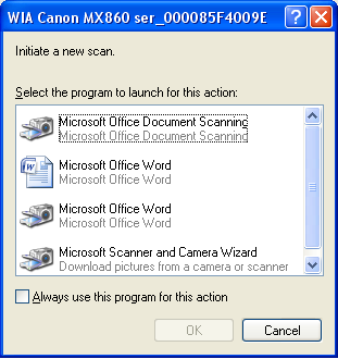
Today in Windows XP, I double clicked on a scanner icon under “My Computer” after installing a new scanner. Here’s the dialog that popped up:

A few gripes worth considering:
- The phrase “Microsoft Word” is mentioned 4 times.
- 3 out of 4 of my options have repeated text (once in black, and again in gray, in case you prefer gray text over black text)
- The entire serial number of the scanner is shown in the dialog. I’m sure this was done to guarantee uniqueness, but what a pain for the user, eh?
- What does the phrase “initiate a new scan” mean? Sounds like programmer speak.
- What is the difference between the “Microsoft Word” with a document icon and the “Microsoft Word” with a camera icon?