Qt Stylesheets Tutorial
 Stylesheets add spicy flavor to your boring Qt GUIs.
For a long time, Qt has allowed you to decorate your GUIs with CSS’ish style sheets. Inspired by the web, stylesheets are a great way to stylize your Qt GUI, but it seems that few people use them. In this tutorial, we’ll create an example dialog in Qt using Designer and stylesheets. This tutorial assumes that you can get around in Qt Designer, and that you understand a little about Qt layouts.
Step 1 Create a new empty form, named MyLoginForm.
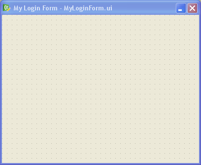
Step 2 Add a QFrame to your form, and apply a vertical layout to your form (any layout will work actually: vertical, horizontal or grid). Give your form about 30 pixels of layout margin around its perimeter. Name the QFrame “mainFrame”. When dealing with stylesheets, it’s convenient to name your widgets in Designer, even if you don’t plan to use them by name in your code (we won’t be writing any code besides CSS in this tutorial).
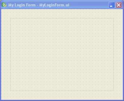
Step 3 In Designer’s object inspector, right-click on the top-level entry in the tree (called “MyLoginForm”), and select “Change styleSheet…” from the menu. You’ll get a little editor dialog like this:
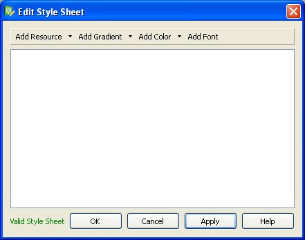
This is where we specify the style sheet for our form. You can put a style sheet on any widget in your form, but I prefer to do all my stylizing at the parent widget (“MyLoginForm” in this case). I prefer to do it this way because you’ll never have to go hunting to find your style sheet — it’s all in one place in your form. Since stylesheets cascade down to the child widgets, you can stylize any widget in your form from this point.
Let’s type in some CSS into the style sheet editor, like this:
#MyLoginForm {

background: gray;

}
#mainFrame {

border: 3px solid gray;

border-radius: 40px;

background: white;

}
After clicking OK on the editor dialog, you should see this:
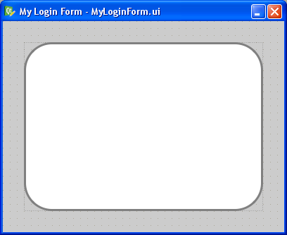
If your’s doesn’t look like this, you may have forgotten to change the parent widget’s name to “MyLoginForm” or the QFrame’s name to “mainFrame” (yes, capitalization does matter — Qt stylesheets are case sensitive). Or you may have mistyped something into the CSS dialog.
One cool feature is that you get to preview the style changes right as you make them. You don’t have to compile, save, or run anything. Designer does a very good job of showing your stylesheet changes live (WYSIWYG for you old-timers).
Let me explain what we just did. In CSS, a pound sign, ‘#’, in front of a name is how we stylize an individual widget by that name. In our example, #MyLoginForm identifies the parent widget (i.e., the background area). All we did there is give it a gray background with background: gray;.
For #mainFrame, we gave it a thick gray border, a white background, and rounded corners.
Step 4 Let’s add some widgets to make this dialog actually do something. Drag and drop a pair of QLineEdits, QLabels, and a single QPushButton on the form inside “mainFrame” and arrange them roughly like this:
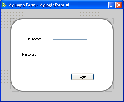
Step 5 Now apply a grid layout to “mainFrame”. Just select “mainFrame” by clicking on it (taking care not to accidentally select one of the QLineEdits or QLabels instead). Then click the grid layout button in Designer’s toolbar (optionally, you can go to the menu bar and click “Form” -> “Lay Out in a Grid”, or just press Ctrl+5 for you keyboard hackers).
Then give your layout some margin. I used 50 pixels of margin and 15 pixels for both vertical and horizontal spacing.
This is what you should have now:
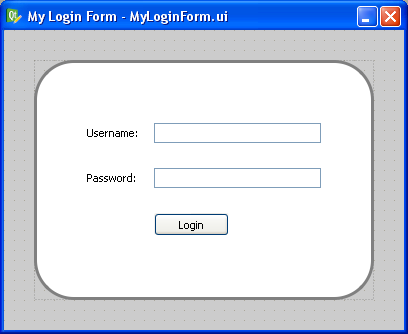
Step 6 Let’s stylize those boring QPushButton and QLineEdits. Add this to the style sheet for MyLoginForm:
QLineEdit {

padding: 1px;

border-style: solid;

border: 2px solid gray;

border-radius: 8px;

}
QPushButton {

color: white;

background-color: QLinearGradient( x1: 0, y1: 0, x2: 0, y2: 1, stop: 0 #88d, stop: 0.1 #99e, stop: 0.49 #77c, stop: 0.5 #66b, stop: 1 #77c);

border-width: 1px;

border-color: #339;

border-style: solid;

border-radius: 7;

padding: 3px;

font-size: 10px;

padding-left: 5px;

padding-right: 5px;

min-width: 50px;

max-width: 50px;

min-height: 13px;

max-height: 13px;

}
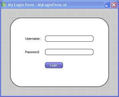
Notice that we didn’t use the pound sign this time. When you omit the pound sign, you are specifying a “class” of widgets to stylize instead of a single widget by name. So in this case, we stylized all widgets of type “QLineEdit” and “QPushButton” (and any widget that may inherit from those widgets too).
That gives the QPushButton a cool gradient look and rounds the edges of the QLineEdits, like this:
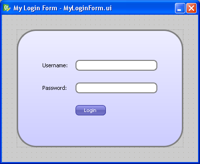
Step 7 Now let’s make that boring white background a gradient instead. Replace the “background: white;” line in the “#mainFrame” section with this instead:
background: QLinearGradient(x1: 0, y1: 0, x2: 0, y2: 1, stop: 0 #eef, stop: 1 #ccf);
Now you should see this:
Step 8 Since stylizing is all about detail and little tweaks, let’s mess a bit with the label font and the background color by changing the background for “#MyLoginForm” to “background: white”, and adding this:
QLabel {

font-weight: bold;

font-size: 15px;

}
Now we get our finished product:
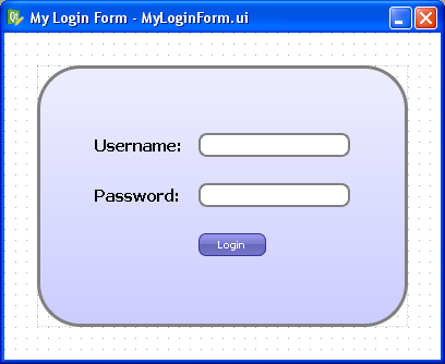
Isn’t it great how much you can do in Designer with style sheets? There are even things you can do with style sheets that can’t be done without writing lots of yucky C++ code. For example, you can change the border style of just a single side of a QFrame.
Oddities
There is one gotcha to keep in mind when using style sheets: Once you use a style sheet, it will often override other properties, like the “font” property or the “frameStyle” property. Keep this in mind when Designer changes properties you didn’t expect.
The other oddity with style sheets is that there’s no way to “include” external style sheet files into your widget’s style sheet. This means that you can’t have a common style sheet that gets applied to your entire application like you can in the web. I have a Qt patch that allows you to do this, but so far the Trolls haven’t done anything with it (to my knowledge). This would be immensely useful.
Cross Platform Note
A style sheet tutorial wouldn’t be complete without a comment on cross-platform issues. The dialog we just designed will look exactly the same on Linux, Windows, and Mac OS X because we stylized it so aggressively. If you want your widgets to look native on each platform, you should generally use style sheets sparingly, but if your goal is to have a consistent look across all platforms, style sheets are your best friend.
Conclusion
Now that I have discovered the power of style sheets in Qt, I use them whenever possible. What cool things have you done with Qt style sheets?
83 comments to “Qt Stylesheets Tutorial”
%s/MyLoingForm/MyLoginForm/g
Thanks Stuart. Apparently “Loing” forms aren’t quite as socially accepted as “Login” forms. In time perhaps.
Though they make a great fashion accessory.
Very cool to see someone playing around with the style sheet capabilities of Qt, I really look forward to the day KDE adopts it as its primary styling mechanism. (If such a day arrives)
Thanx for these great tips! Way to go!
Thanks,
A simple tutorial like this was all I needed to break the ice on my Qt GUI development.
Qt should link to this!
I quote Gary!
Well done!
Thanks
Elegant tutorial.
Thanks!
Greetings from Philippines!
Sir, can you do a tutorial on creating fisheye menu in QT?
I would appreciate it so much if that will be realized.
Rey
This is a very helpful tutorial!
Many thanks
^^
very cool!
Thanks & Happy new year :)
is there any way to import any image file in the frame or the form itself? like i want to import any jpeg or png image??
is there any way to import an image in the frame or the from itself? like i want to import a jpeg or png file..
How exactly did you create the button gradient code?
Vadim: Trial and error my friend. I looked closely at some interesting gradients online, opened them up in GIMP, and looked at the colors at points across the vertical area of the image. That led me to this gradient.
Also, yes, you can use an image as the background, like this:
background-image: url(:/path/to/image.png);
Notice the “:” character. That means the image is in a .qrc file (Qt’s Resource System). You can also use absolute or relative paths there.
Be sure to check out the “background-repeat” property as well.
Good luck!
Rey,
Have you seen this fish eye menu:
http://www.qt-apps.org/content/show.php/QIrDock?content=115318
–Dave
It is mentioned that “This means that you can’t have a common style sheet that gets applied to your entire application like you can in the web. I have a Qt patch that allows you to do this”.
If you dont mind, can I know where to get this patch.
We are in need of this as we are going to start a project where we need common styles.
Ashish:
Here’s the patch in Qt’s task tracker:
http://bugreports.qt.nokia.com/browse/QTBUG-2047
–Dave
First I want to say thanks for a great tutorial, it has helped me alot.
But I have two question.
I’m trying to use an image as background, so I add:
#pushButtonPower {
background-image: url(:/images/power-button.jpg);
}
to my mainWindow stylesheet. The image is visible in qt designer, but not when I compile and run the program. Do you have any idea why??
Another question I have is that if I do a PushButton and add the stylesheet like in the tutorial:
#MyPushButton {
color: white;
background-color: QLinearGradient( x1: 0, y1: 0, x2: 0, y2: 1, stop: 0 #88d, stop: 0.1 #99e, stop: 0.49 #77c, stop: 0.5 #66b, stop: 1 #77c);
border-width: 1px;
border-color: #339…. and so on
the button does not change when I press it. Usually with buttons and if I only use the two first lines, color and background-color, it looks like the button is pressed down then I use it in my application.
Why is that and how can I fix it??
Hopefully you have time to answear my questions.
Many thanks!
/Linda
Try adding this to your C++ code:
setStyleSheet(styleSheet());
Sometimes I’ve noticed that Qt forgets the style sheet and you have to “remind” it.
For your button, add a new style like this:
#MyPushButton:pressed {
padding-top: 5px;
}
See my example above.
Good luck!
–Dave
Thanks, that really helped.
I realized, after a lot of time and tries, that the button doesn’t look like it’s beeing pressed when there is no text on it. That’s why your code wasn’t working on my button, which has no text on it.
So I am going to keep a frame around the button so it will looked pressed when it’s beeing clicked.
Thanks again!
Hi
Is there a way to change only some path of the stylesheet runtime.
I have a stackedwidget, with 4 page, under each page I have a custom stylesheet defining all elements on that page. Thing is I would like to change the background image runtime. But I do not know how to. If I change something runtime it looks like I need to write everything again to that stylesheet. I general only thing I would like to do is to change brackground image, It do not work with palette, as long as there is something in the stylesheet.
Global Style Sheets:
http://wiki.forum.nokia.com/index.php/CS001502_-_Applying_a_Qt_style_sheet_to_an_application_via_QApplication
Thought you might find this useful.
Global stylesheets are nice but they doesn’t let you see it while you edit in Designer.
One work-around I’ve done in the past is to make a keyboard shortcut (Ctrl+R) to reload the stylesheet in the running application. This is better, but still not good enough.
Another solution I proposed to the Trolls is to allow #include inside stylesheets in Designer. This way, the Designer stylesheet could #include another (global) stylesheet, which you could see in Designer while you edit.
Michael Rahr:
There is no easy way to do this. What I have done in the past is to put magic comments in the stylesheet and then done a string replace at runtime, like this:
/* BEGIN RUNTIME EDITABLE STYLESHEET */
background-image: url(:/images/foo.png);
/* END RUNTIME EDITABLE STYLESHEET */
Hi, Dave
It’s very useful,
but i don’t know how to use your patch…
I see only descripton, seems like part of your code?
Can you show me how to use this patch more clearly?
Many thanks!!
Tommy,
Apply that patch to the Qt source code. That patch was generated against Qt version 4.3.4, so it may or may not apply cleanly to newer versions. You can either use the “patch” program in the root folder of your Qt installation, or you can manually copy and paste that code into “src/gui/text/qcssparser.cpp”. Just add the lines with the “+”.
Good luck!
–Dave
Oh, I got it, just insert those code into that .cpp file!
Thanks!!
But, still do not know how to use it..
Oh, I see. That patch just makes it so you can include external stylesheets files using @import in your style sheets in Designer. That way, you can have a single style sheet for all your forms, and still have a nice graphical environment in Designer.
Thanks for your kindly quick response!!
It really helps a lot.
If it’s not bothering…can you tell me that:
How to include the external qss file in different forms, and where should I
put “@import” at?
Many thanks again!
Tommy,
You can use @import in your stylesheet code just like #include in your C++ code like this:
@import(:/style.css)
Assuming you applied that patch and rebuilt Qt.
You may need quotes. Can’t remember right now. But seriously, this is not standard right now and rebuilding Qt just for this feature is a big job and I don’t recommend it unless you think you really need it.
Hi! My name is Alberto. I’ve seen that you use the QtDesign to add style sheet. I’ve been surfed trying to get a way of doing style sheet by code. I mean… my problem is that I’m trying to do dynamics buttons(they are created when the program is running), but I would like to change their styles… changing colors, adding borders, etc.
Is it possible to do it without using the QtDesign?
Where should I add the style sheet ?
Thanks in advnce!
Alberto, yes this is possible. If you create a style like this in Designer:
QPushButton {
…
}
Then, even dynamically created buttons (i.e., buttons created with C++ code) should also use the style.
Alternatively, you can write your stylesheet code in C++ using the setStyleSheet() method on any QWidget.
Dave,
Thanks for this, I was banging my head against a wall, wondering why app.setStyleSheet(“:/path/to/mysheet.qss”) wasn’t working. But at least you can do:
./my_qt_app -stylesheet path/to/mysheet.qss
Thank you very much! You helped me to understand how i can use stylesheets with (py)qt4
While you can’t specifically include files, it should be noted that when you add widgets to widgets the styles are inherited. So if you apply a master global style to the main app widget, it will style mostly everything in the app that is parented, and you can apply the same master global style to unparented objects.
Jimh: Yes indeed. That is true, but you cannot see those styles while editing in Designer. Hence, the feature request.
Gracias men…
Thank you very much for this tutorial.I have a doubt.How can we cut out the extra portions(i.e.,the dotted lines in four corners of the above widget) from the widget? Please give me the answer for my question
sekaran” The dotted lines only appear in Designer. When you compile and run your application, they will not appear.
Hai dave;
Thank You very much for quick reply.The dotted lines also appear in application.When i click the pushbutton or anyother widget in my application, the dotted lines appear.The Qt designer creates a widget with it’s standard size propertie.When i try to change the size and give style sheet to that widget in my application,the style sheet is set for the size which i have fixed, but the excess space is empty and the outer dotted lines for that widget also appears.
for example,
standard size of pushbutton is 60,25.I shrink that as 50,25 and set stylesheet.Now the stylesheet is set for the size 50,25.the extra 10 pxs appears as empty one, but the dotted lines at right hand side of the widget also appears.
sekeran, you should probably not be setting pixel sizes in your application. Let Qt’s layout system do this for you. Did you apply a vertical layout to your form and a grid layout to “mainFrame”?
great tips for beginners indeed, thnks.
thanks, great tutorial for new beginners.
Hi
When i create style sheet for Mdichid the style sheet appear ok on the Qtdesigner but not at runtime, Any advice please.
Sometimes in your C++ code, this will fix stylesheets appear:
setStylesheet(stylesheet());
See if that helps.
I put the setStylesheet(stylesheet()); in the constructor of the child window but that does not help. Any advice please.
Without more information, I can’t help. A better forum for this kind of question is qtcentre.org or the qt-interest mailing list. Good luck!
Hi Dave. The QtDesigner Stylesheet for MDI Child only works for control within the form but not on the form itself. I try changing the backgroud of window it does not work but by putting a frame and change on the frame it works.
Yes, that is often the case. I have not found a workaround for the issue you describe. Perhaps try using setObjectName().
excellent trick