Linux Desktop: How many more years?
How many more years am I going to have to wait before I get a Linux desktop that doesn’t look like it was cobbled together?
Before I rant about the Fedora 11 user interface, I have to say that I am a huge fan of Linux. I write code for Linux all day at work (both user interface and back-end code), and I love it. Linux is great. However, the Linux desktop has not kept up with the quality of its back-end counterpart, and I want to talk about it today. Thanks for reading.
I installed Fedora 11 today, the latest and greatest that the Linux community has to offer. I opted to use the KDE version just for fun. Here’s what I got:
Random Fonts
When I logged in for the first time, my fonts were too large, so I opened the “System Settings” (by the way, that name is way too scary for lay users) and navigated to the fonts section. This is what I saw:
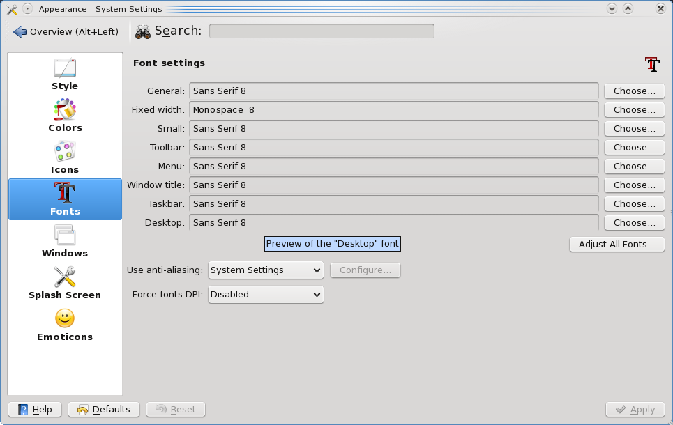
First of all, I have to change the font size 8 times. Why? Because I don’t know what each of those 8 settings means, and I want to make sure I get them all. Why do I have a “Menu”, a “Toolbar”, and a “Small” font? If you’re going to give this much fine grained control, you have to at least show screenshots of where each of these fonts shows up on the screen. Your average user does not know the difference between a “Menu” and a “Toolbar”.
Secondly, this font preferences screen has at least 4 different fonts on it that I can see. How’s that for ironic?
Awful System Settings
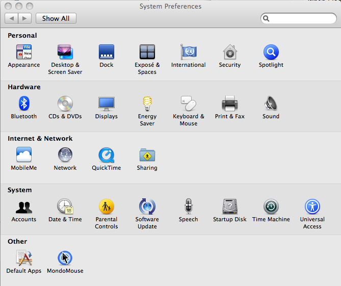
KDE seems to be trying to emulate Mac OS X and Windows Vista at the same time, but failing to emulate either of them very well. Compare this screenshot from the Mac OS X system preferences and the equivalent KDE attempt.
Mac OS X (clean, efficient, polished)
KDE (sloppy, inefficient, unappealing):
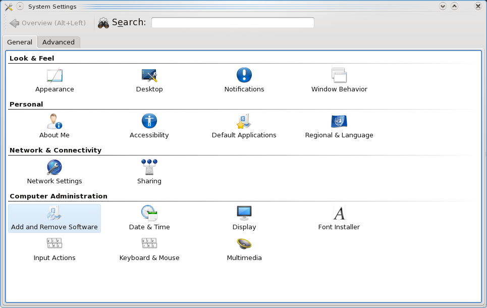
Notice how the Mac OS X preferences screen manages to fit twice as many icons in the same amount of screen real estate, and yet, somehow the items are easier to read? That’s because the Mac uses word wrapping for long item names. Focus on this item from the KDE System Settings:
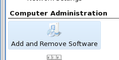
Why would you not word wrap that text? Not word wrapping that text forces all the other icons in this column to be disproportionately wide. This causes the screen to both waste space and make each column width irregular.
Also take a look at the sheer quantity of lines on the KDE System Settings screen. Lines are the enemy. They make the user interface complicated by adding more information that your brain must (subconsciously) process. The KDE System Settings has a perimeter of 3 lines. The Mac OS X System Preferences has 1.
Lasty, notice what happens when I click on “Appearance”. The screen morphs into a totally different kind of user interface. It went from a grid-shaped navigation pane to a left-hand navigation bar:
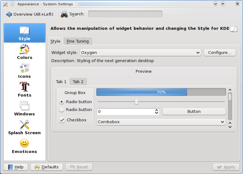
The change in navigation is startling. It looks like the KDE team took a stand-alone form and crammed it into this one. In fact, I’m sure that’s what they’ve done. That’s pretty cool from a programmer’s perspective, but it makes for inconsistent UI.
Right (or was it left) Clicking
Consistency is crucial to an easy-to-use interface, especially when it comes to user input like mouse clicking. When I logged into my new Fedora 11 desktop, I noticed a tray icon in the lower left that looked like two networked computers. I right-clicked on it so I could try to turn on my wireless networking, and this is what I got:
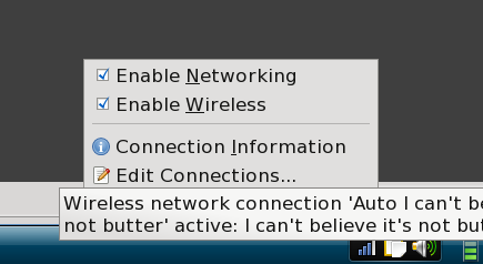
I can’t tell what I’m supposed to do here. I right-clicked. I got a context menu, which is usual and customary for right-clicking. But nowhere do I see a place to choose my wireless network. I tried turning off the wireless networking, and turning it back on. That didn’t help.
Finally I tried a left click, and I got a different context menu (big no no):
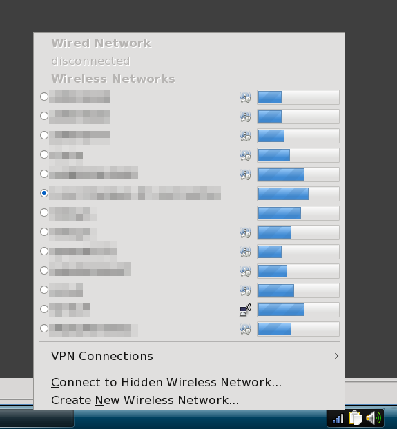
It appears now that KDE has adopted a paradigm of providing two different context menus depending on which mouse button you click. In my view, these two context menus should be merged into a single context menu that appears when you right click. Look how Mac OS X does it. You can right click or left click and you get the same all-in-one context menu:
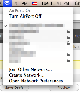
This seems so obvious and easy to get right, and it’s crucial because this isn’t the kind of feature that users will use every day. The less frequently used stuff needs to be the most obvious.
Suspend Still Does Not Work
As I was writing this post (on my Mac), my Fedora 11 laptop went to sleep and suspended. It made two ding-dong sounds before it did so. When I pressed the power button to wake it back up, I was greeted by lots of spinning fan sounds, a blinking WiFi light, and a blank screen. I had to power off the laptop to bring back a login screen.
I have been using Linux for 8 years, and only one distribution ever provided me a working suspend feature: Red Hat 7.3. Yes, the free Red Hat, back before Fedora existed. In the mean time, I’ve used Windows 95, 98, 2000, XP, and Vista, and every single one of them has provided a functioning suspend feature, and I’m no fan of Windows.
Logout
When I click the “F” menu, and then click on the “Leave” tab, the menu morphs into a list of “Leave”-like options, like shut down, restart, and logout. If I click “Restart”, I get a picture of a stretched-out moon with some text crammed next to it that says “Restart Computer”. This text doesn’t look like a button. It doesn’t act like a button when I hover on it. But guess what, it’s a button. KDE wants me to click on that button-like thing to confirm that I really want to shut down the computer. Here’s what it looks like:
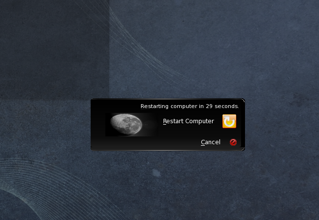
When you want the user to click on a button, it needs to look and act like a button, even if you’re trying to do fancy graphics.
While I’m on the restart confirmation box, why is it so small? You have a huge screen. Spread out a bit. Get a little breathing room. Put about 50 pixels between each widget in that box, and give it about 100 pixels of padding around its perimeter.
Oh, and fix that moon. It looks like it got sat upon. :)
Chopped Text
I think this dialog speaks for itself:

This was one of several dialogs that I could not read fully due to chopped text.
Icon Size Inconsistency
Icon sizes are not consistent with other icons, nor are they consistent with input elements, like the little “plus” signs in tree views. Take this example:
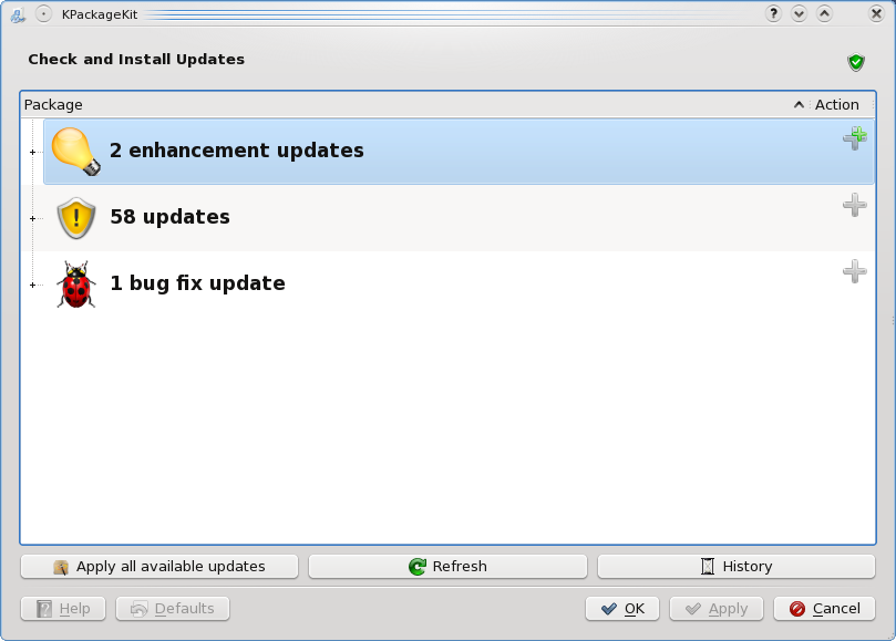
Notice how the picture of the bug is about 20 times bigger than the “plus” sign to the left of it? In my opinion, this should not be a tree view at all, but rather a nice flat list with header text between the categories. Keep it simple. Perhaps just show the quantities, and then provide a “Show details” button.
Notice also the two different styles of buttons along the bottom of the form? The bottom row uses fixed width buttons, while the next row up uses super-wide-fill-the-screen buttons. Additionally, as near as I can tell, the lower row of buttons (“OK”, “Apply”, and “Cancel”) are not actually useful. I can get what I want without them. So not only are they inconsistent, they are also superfluous.
So What Do You Actually Like?
I do like the twirly ribbon thing that appears while you are logging in to KDE. That thing is pretty cool. Smoothly animated, and yet it gives you actual progress while KDE is starting up. It is oddly engaging. I can’t take my eyes off it.
I like the new default desktop wallpaper (though I liked the Fedora 10 solar flare better).
Conclusion
In conclusion, I think that the KDE desktop as packaged by Fedora 11 needs a good, long walkthrough with a fine-toothed comb by a team of user interface experts. I encountered all the inconsistencies noted in this article within the first 15 minutes of using Fedora 11, and I’m sure a focused team could find dozens more. If they’re fixed, I think Fedora 11 and KDE show great promise for the future.
14 comments to “Linux Desktop: How many more years?”
A fair review. Not sure if all of these things are just Fedora related or KDE problems. Things like the squashed moon and the chopped text, I don’t get it on a clean Arch install. Thats not to say your problems don’t exist.
How about some bug reports so the KDE project can clean some of these issues up. You have a decent eye for detail how about joining the KDE bug squad?
The “two different context menus” thing is actually from Gnome’s NetworkManager applet, which is included by default in the KDE desktop under f11.
I’d also argue that suspend is still hit and miss under any combination or hardware and distro. If you have a nVidia card in there, f11 switched the default driver to nouveau which has no suspend/resume support.
Not that I’ve *ever* been able to get a computer with an NV card to resume properly.
The left/right complaint is a gnome issue, not kde.
Fedora 11 is shipping gnome’s network manager applet because the kde network manager applet isn’t ready for qt4 yet.
But, it wouldn’t matter for this review, because I’m sure you would have had much to say about knetworkmanager’s interface :)
Even still, while not always fully functional nor pretty, the linux desktop still allows me to “get stuff done” (C).
KDE 4 is still a total mess. I think the overall plasma graphical stuff is more appealing than KDE 3, but it doesn’t work well if you don’t have a video card that supports compositing. I don’t like the Oxygen widget theme, though. And as you pointed out, the user experience details are still full of terrible crap. The best I can say about it is that parts of it are really pretty and there are lots of configuration options.
Gnome seems to get a lot more of the user interface details right, although this comes with some significant sacrifice of configuration options. It’s still got some of those nasty double-context menus, though. And its default UI themes are starting to look a bit dated. All-in-all, I think Gnome provides a better UI experience right now.
I don’t like KDE either. Mainly because of all the problems described here. But why gripe about Fedora Desktop? (aside from the fact that you are familiar with it) In my opinion Ubuntu is the closest thing you can get to a Linux Desktop, and by default it uses gnome, which is IMHO a better and easier to use desktop environment.
@Wade
“The left/right complaint is a gnome issue, not kde.
Fedora 11 is shipping gnome’s network manager applet because the kde network manager applet isn’t ready for qt4 yet.”
I’d like to respectfully disagree with this statement. The left/right complaint *is* a kde issue. Apparently kde doesn’t have a network manager applet and so the gnome one is being borrowed to provide that functionality. For a graphical desktop environment to be complete, it needs to provide a graphical way to configure the network, if kde doesn’t have one, so f11 is forced to borrow one from gnome, the blame lies with kde for not providing a good alternative not with gnome, for having their applet borrowed.
I think that the only real way to have Linux be usable is by setting up some minimal keyboard shortcuts and then do everything from the command line. I’ve used WindowMaker, KDE, and GNOME, and as far as I’m concerned they’re all identical. Now I know that they’re really not identical, that they each have different philosophies that guide they’re development, and they all have different features and bugs, but I don’t use any of the fancy features because they don’t seem to help me be more productive. I’ll be right at home using any graphical desktop environment that provides the ability to map the following keyboard shortcuts:
Ctrl-Alt-a – Terminator (a terminal emulator)
Ctrl-Alt-m – Firefox
Alt-# – Switch to desktop #
Anything else really isn’t going to be used by me enough for me to bother fixing a bug or even file a bug report.
So why does GNOME’s network manager applet pop up a context menu in response to both left and right mouse clicks? That’s the real crux of the issue. It does not conform to the general convention of context menus.
–Dave
Hello Dave,
Nice critics, but I have some comments :
For the first problem (font size), I can see a “Adjust All Fonts” button. Isn’t that a solution ?
For your second problem, it’s true that the KDE dialog was awful, but you can try to change the theme/icon theme.
For the Right/(Left) clicking issue : this is not related to KDE/Fedora, this is related to Network Manager. And I think this is the true comportment : right click for settings, left click for management. And you won’t find this in Mac, because there’s no right click :)
For you last issue, I don’t think it’s annoying, and anyway, this is theming stuff.
pistache,
Hugo,
Thanks for the critiques. May I offer a correction. Mac does indeed have right-click and has for years. The items in the top-of-the-screen menu bar are left- or right-clickable, but they do the same thing.
Nowhere else have I seen a left-click give a context menu and a right-click give a *different* context menu.
–Dave
Yeah, some of the Winderz notification icons have left and right clicks corresponding to different context menus. I am most sure I have run across this, maybe in PowerISO and definitely DEAMONtools (sp?).
A cluttered desktop is a small price to pay, considering the *moral* superiority you gain when using Linux…. he he he, j/k
You should give 4.4 a try as soon as it comes out there are many, many improvements, some of the things you mentioned are specific to your distro and not visible in other places…
Other are things we should fix and thanks for pointing them, the cool thing is that you can join us (like you did just now) in the effort to do something better.
Still i think you will be very happy about 4.4, I am :D
The only problem I have with this ipost is this quiote.
“I have to say that I am a huge fan of Linux. I write code for Linux all day at work (both user interface and back-end code), and I love it. Linux is great.”
Quit your belly aching and do something about it then.
Which leads me to another issue with Linux: You’re not allowed to complain about it apparently, especially if you are a developer yourself.
I’m late :0 but You nailed it bro. I hate the GUI. They just don’t get it.
to quote “Quit your belly aching and do something about it then”.
belly aching, what?
Well, apparently, linux and its distros needs more artists and devs.
Current devs are nice enough for sure, but that doesn’t mean we can’t provide feedback especially reasonable ones like this blogger did. Is linux community supposed to immune to feedbacks?